With the new year around the corner we wanted to see if we could challenge ourselves and create yet another calendar. Only this time we wanted to consider the possibility of building something that could be potentially turned into a product as well. Sustainability was a key factor right from the start. We wanted to create a calendar that could be used for the year to come and the years to come after. And it goes without saying that we wanted this product to be creative, innovative and inspiring. Something that could be great for personal use as well as gifting.
Right from the beginning we had the thought of creating something that would use the innate ability we human beings possess to find order in disorder, to recognise patterns amidst seemingly chaotic arrangements. With the motives set, we went about exploring the different possible directions in which we could come up with concepts.
It was established early on that a chaotic arrangement of the elements of the calendar (the days, dates and the months) and subtly bringing out the required ones with the help of colourful rings was a good place to start with. Multiple explorations were done in this direction. Concepts included chaotic arrangements made with the help of random placement of the elements with the sizes being the only differentiating factor. Others included selective placement of the elements with their own chaotic arrangements.
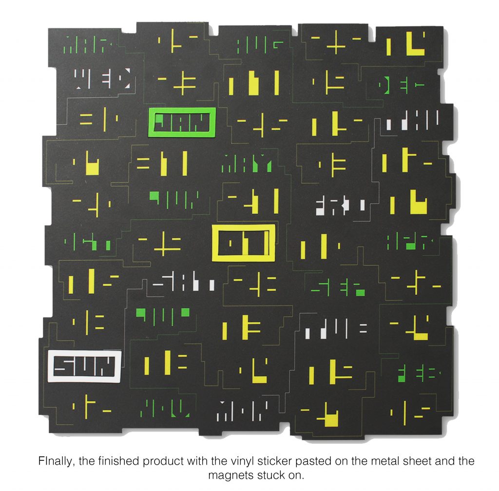
A breakthrough occurred when we were experimenting with bold fonts. It gave way to explorations that effectively used the negative spaces around the font to create a chaotic and almost cryptic feel to the overall arrangement. This gave rise to further explorations with a typeface specifically created for this purpose. Things began to fall in place at this stage as we were able to use the new typeface created by assigning different sizes and colours to specific elements. Further refinements included tweaking the font sizes and changing the colours to create an aesthetically pleasing feel to the product. With everything done we noticed that there was still some room for improvement as the magnets when placed in the wrong positions would still not reveal what was inside. So we decided to include guide lines running across the entire area of the product that would help users locate the exact placement of the rectangular rings.
So that was it. The product would have cryptic elements scattered across its surface and when the rectangular rings are placed over it the right way, the cryptic elements would become readable, as if by magic. We tested the said design by making prototypes and collected user reactions and feedback. To our pleasant surprise we noticed the response was unanimously positive. With that, we had all the motivation and justification to jump start production.
What was left was to figure out how the product could be actually made. At this stage, it immediately struck us to make use of the vinyl magnets commonly seen on fridge magnets as they could be easily made in different shapes/sizes by die punching. And the calendar itself was decided to be made in sheet metal, as it could be powder coated to any desired colour and the magnetic rings would stick on. So everything was set for production. Now what was left was to think about the infographics for the product. Oh and very importantly, a name.
The newly chosen direction (bold fonts making use of negative space to create the chaotic/abstract/cryptic feel to the product) inspired us to come up with a name along the same lines. After several discussions it was decided that the product would be called “Crypto”. And as for the infographics we wanted to include a key-sheet, usage instructions and the inspiration behind, and pricing, legal information, etc. of course.
We decided to go with white powder coating for the calendar and the vinyl magnets were punched in yellow, green and white colours. The infographics was done with black colour and printed on a transparent sticker which would be stuck on the backside of the calendar. And a nail hook was welded on to the backside so the calendar could be hung on the walls.
Many people who aspire to have a vibrant design career path often have no idea where to begin. Let’s say you’re a creative individual who is artistically inclined, and you’ve decided you want to continue on the path of design. You would be conflicted on which field of design to chose. Which colleges to apply …
Covid-19. Who knew that 2020 would bring about such drastic changes to our lives. Lockdowns, work from home and the ever lingering fear of the dreadful corona virus. We are forced to look at our ways and we are more responsible than ever in keeping ourselves and our loud ones safe during this pandemic. As …
One of the lesser known areas in which design creates an impact is social issues. Gemklip has always believed in turning problems into opportunities. However, designing a Social Campaign / movement is a lot like designing a product – it is to turn a problem into an opportunity. This is one of Gemklip’s core principles. …
A common misconception is that the design process and design thinking are both the same thing. People belonging to many different fields try to employ design thinking so that they can think more “creatively”. However, they end up following the design process. People belonging to fields other than design can’t benefit from this. What’s the …
Crypto – A perpetual Calendar
With the new year around the corner we wanted to see if we could challenge ourselves and create yet another calendar. Only this time we wanted to consider the possibility of building something that could be potentially turned into a product as well. Sustainability was a key factor right from the start. We wanted to create a calendar that could be used for the year to come and the years to come after. And it goes without saying that we wanted this product to be creative, innovative and inspiring. Something that could be great for personal use as well as gifting.
Right from the beginning we had the thought of creating something that would use the innate ability we human beings possess to find order in disorder, to recognise patterns amidst seemingly chaotic arrangements. With the motives set, we went about exploring the different possible directions in which we could come up with concepts.
It was established early on that a chaotic arrangement of the elements of the calendar (the days, dates and the months) and subtly bringing out the required ones with the help of colourful rings was a good place to start with. Multiple explorations were done in this direction. Concepts included chaotic arrangements made with the help of random placement of the elements with the sizes being the only differentiating factor. Others included selective placement of the elements with their own chaotic arrangements.
A breakthrough occurred when we were experimenting with bold fonts. It gave way to explorations that effectively used the negative spaces around the font to create a chaotic and almost cryptic feel to the overall arrangement. This gave rise to further explorations with a typeface specifically created for this purpose. Things began to fall in place at this stage as we were able to use the new typeface created by assigning different sizes and colours to specific elements. Further refinements included tweaking the font sizes and changing the colours to create an aesthetically pleasing feel to the product. With everything done we noticed that there was still some room for improvement as the magnets when placed in the wrong positions would still not reveal what was inside. So we decided to include guide lines running across the entire area of the product that would help users locate the exact placement of the rectangular rings.
What was left was to figure out how the product could be actually made. At this stage, it immediately struck us to make use of the vinyl magnets commonly seen on fridge magnets as they could be easily made in different shapes/sizes by die punching. And the calendar itself was decided to be made in sheet metal, as it could be powder coated to any desired colour and the magnetic rings would stick on. So everything was set for production. Now what was left was to think about the infographics for the product. Oh and very importantly, a name.
Related Posts
Design Career Path
Many people who aspire to have a vibrant design career path often have no idea where to begin. Let’s say you’re a creative individual who is artistically inclined, and you’ve decided you want to continue on the path of design. You would be conflicted on which field of design to chose. Which colleges to apply …
KOVI – premium safety accessory
Covid-19. Who knew that 2020 would bring about such drastic changes to our lives. Lockdowns, work from home and the ever lingering fear of the dreadful corona virus. We are forced to look at our ways and we are more responsible than ever in keeping ourselves and our loud ones safe during this pandemic. As …
Social Design
One of the lesser known areas in which design creates an impact is social issues. Gemklip has always believed in turning problems into opportunities. However, designing a Social Campaign / movement is a lot like designing a product – it is to turn a problem into an opportunity. This is one of Gemklip’s core principles. …
Design Thinking Workshop For Corporates
A common misconception is that the design process and design thinking are both the same thing. People belonging to many different fields try to employ design thinking so that they can think more “creatively”. However, they end up following the design process. People belonging to fields other than design can’t benefit from this. What’s the …